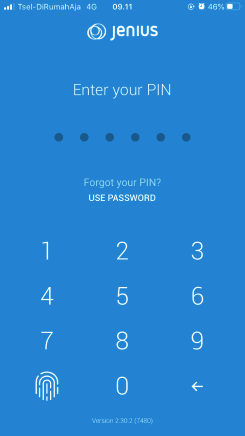
The “PIN Screen”
How UX Principle Matters Even to the Simplest of Form

Action Beats Motion
So this is my first step into the world of “User Experience”, everyone has the same saying
“Go out there, observe, think, and write it down.”
The whole “UX method of choice” is vast. It can be overwhelming to some people, including me. Just like how new things, in general, can always be overwhelming. It might create fear of failure to some, hence preventing action. So instead of finding the perfect way to do things, I thought of why not just start small and see where it goes.

The Identified Problem
The image posted above is JENIUS’ app PIN-entry screen. In short, PIN stands for Personal Identity Number and it is a security measure to help secure valuable and crucial information, data, belongings, etc. from unauthorized access. JENIUS itself is a financial application in Indonesia, hence this layered/extra security is often the choice.
You may be thinking
“What’s wrong with it? With a simple explanation, the only thing people have to do is to press the number that they’ve defined before.”
True. But as I’ve been dealing with digital interfaces throughout my whole life, this one was one of the many that feels off. So I asked myself
“Is it just me? Everytime I interact with it, it doesnt seem natural, why?”
This time, rather than ignoring my feelings, I decided to write this one down as a starting point to start, to also get a reflection on how my research has been done, and to get feedback from people reading it. It would also be helpful for my future writings and research as constructive criticism/feedback is key for improvements.
Find Reference
I did my homework around the web and my real-life environment, as I understand that I couldn’t be the only person that has the same thought regarding this particular screen/design, also some intensive reads around the topics of User Experience and User Interface, its theories, books, past research, etc.
Turned out I was right. I’ve found some overhaul redesigns of the app and found plenty of great ones — from colors, layouts, icon redesigns, and all its rounded-corners — a real treat for the eyes. Here are some that I found:
The posts above mentioned things about the problem involving color-contrast, visibility, similar icons, etc. but didn’t quite nail my WHYs
“Why was this existing interface felt like it needed some tweaking, felt unappealing to some people, including me? Is there an explanation to it?”
BUT lets also not forget on
“Why did the app developers/designers made it like so? Surely, there are decisions that were once made from their side also.”
To approach this problem, I’ve done my reading from Jon Yablonski’s “Laws of UX” book — it provides an understanding of human psychology specifically on how they behave and interact with digital interfaces. From there, I further my understanding of these topics to another great UX guidance on the internet. Such as the NN Group and UX topics on Medium.
Research
To start it off, I require people’s thought around this specific design. I did some interviews with around 5 people ranging from the age of 20–50. Also, I did some competitor analysis specifically regarding how different competitors provide ‘somewhat’ different but similar interface for PIN-entry design.
The interviews started with two questions and two comparison pictures shown in it. I use both to bridge my conversation/interview.

The questions asked was:
- Which one of these pictures do you think is aesthetically pleasing to your eyes? And why?
- Which one of these pictures do you think feels easier to press. “Easier” as in how you can quickly perceive where should you press without having to think twice. And why?
First question, 3 out of 5 answered preferring the left picture. Some of the notable answers were
- “left picture has a clean interface”
- “the right one feels cramped. I feel like there’s so much going on”
The latter, a whopping 5 out of 5 preferring the left picture. The response were
- “Noticeable buttons.”
- “Buttons look feels natural.”
- “I just felt like I know where to press.”
Now the first question seems a bit more on a personal taste hence the different opinions but there must also be an explanation to it. The second question even revealed more interesting insight. Now to dig the answers deeper — like I said earlier — I require facts regarding this.
Psychological Research / UX Principle
There are past-researches been done that provide a better understanding of what humans think and perceive. Related to this specific problem I found Jakob’s law with his 10 principles for interaction design & Hick’s law that strongly correlate with it. In short, Hick’s law stated
Complexity extends beyond just the user interface; it can be applied to processes as well. The absence of a distinctive and clear call to action, unclear information architecture, unnecessary steps, too many choices or too much information — all of these can be obstacles to users seeking to perform a specific task.
and Jakob’s law suggested
Designers to consider common conventions that are built around existing mental models to ensure users can immediately be productive instead of first needing to learn how it works.
From both, we can see the correlation with how the results turned out the way it is. Be sure to read more about them to get a better understanding.
Principles
Taking a look at JENIUS’ design and the interviewee’s response that I quoted, Hick’s law Jakob and Nielsen’s 10 principles have a strong influence on them.

The image above showed how the principles play an important role in how people feel about digital interface, hence their response. Several points even give more insights on how they also affect the whole experience, which I will explain about it next.
A quick note: the keypad (the numbers) for the PIN-entry screen on the iOS version of the GO-JEK app seems to have defaulted like the one shown in the left picture, while the Android version has a similar design/custom keyboards like the one JENIUS has. There is a possibility that Apple is forcing iOS developers to follow Apple’s strict Human Interface Guidelines to ensure that the user experience remains identical even on different applications. Regardless, we will assume it as a decision by the app’s designer, which is GO-JEK’s.
Mental Models
The designers of the iOS version of the GO-JEK app seem aware of how a keypad mental model should look, which is based on things they were familiar with — originated from the real physical world.


Apple’s iPhone PIN-entry screen keypad also added alphabets right below the numbers even though that the passcode only accepts numeric inputs, the possible reason is so that their users can naturally feel like they’re just interacting with a phone. The “natural” feeling will greatly reduce their user’s cognitive load — as explained by Jakob — every time they came across this screen, hence giving a great experience for them.

More on this, just like their real-world counterpart, the circular (rectangular on GO-JEK screen) borders for each number act as a clear sign on where the user should press. The border and its background also lights up every time the number is pressed, which is a simple feedback for the user telling them that they did press it. Just like in real life, you gain that “pressed” feedback to your brain every time you press something, especially a button. As the law of physics stated: for every action, there should be a reaction.
When designs do not align with the user’s mental model, there will be
problems. A misalignment can affect not only how users perceive the products
and services we’ve helped build, but also the speed at which they understand
them. This is called mental model discordance, and it occurs when a familiar product is suddenly changed.
While JENIUS’ design doesn’t differ much from the iOS version of GO-JEK and Apple’s design, it lacks the mental models that I described above. Now this will bring us to the question regarding the designer’s decisions, “why did they do it?” surely they also have reasons for doing so.
The Other Side of the Coin
In life, understanding perspective differences is a must, even though our understanding won’t always be 100% correct, it will lead us to a better version of ourselves, which is wisdom and critical thinking. The same goes for this case. Figuring out the reason behind JENIUS’ designer’s decision will give us new perspectives and insights, creating a similar thinking perspective as the designer did.

As you can see, the design lacks the certainty of where should a user press the numbers. Is it bad? Not quite. By not showing an indicator or a “border” to separate the numbers, it forces the user to focus on where they are exactly pressing, which will greatly decrease the chance of user pressing the wrong number. This screen is also the first that pops out every time the app is first opened, hence the decision of a more aesthetic approach. But doing so created some drawbacks as explained in all the above.
Verdict
This may just be a simple screen or design, but by thoughtfully considering the design decision based on mental models and principles — even for a design as simple as this PIN-entry screen — it would certainly help (me especially) in dealing with much more complex designs in the future.
The goal of this small research is to root out a problem, understand how they actually became a problem in the first place, AND up and foremost — to actually START DOING. It started with a simple question, a quick comparison, and people’s thoughts about it, the rest will just follow along — this cycle is very similar to the Diderot Effect, each action becomes a cue that triggers the next behavior.
For those who are sometimes get overwhelmed but wanted to dive deeper into the world of UX and UI (or anything for that matter), this post should encourage you to start. I am also open to feedback regarding my post/research, as this is my first time of doing so.
Questions?
If you would like to give me feedback or have any questions regarding this project or anything else, I would love to hear it. Feel free to contact me through email (jodierizky.s@gmail.com) or using the response section. Please do check the response section, as I will also put my gathered feedbacks in it.


